

The Design Edition
A peak behind the scenes into the evolution of our logo

When Pagebound welcomed beta users in August 2024, we had a very different logo:
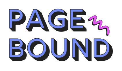
Here you see the signature blue of our book forums and our stark drop shadow. We launched on web first and wanted to stand apart, at a glance, from the sea of beige book tracking platforms. We found an affinity with the neobrutalism design style, itself a reaction against the predictable look of modern minimalism. At the time, as a self-taught designer, I didn’t have the language for our aesthetic. I just knew the vibe it produced: nostalgic old-internet, rebellious and bold, whimsical and cozy.
The squiggle came from the idea of a spiral-bound notebook, an echo of our name, a place to record your thoughts, and a little symbol of how we hoped to bring a new reader community together. This squiggle was a repeated motif across the site:
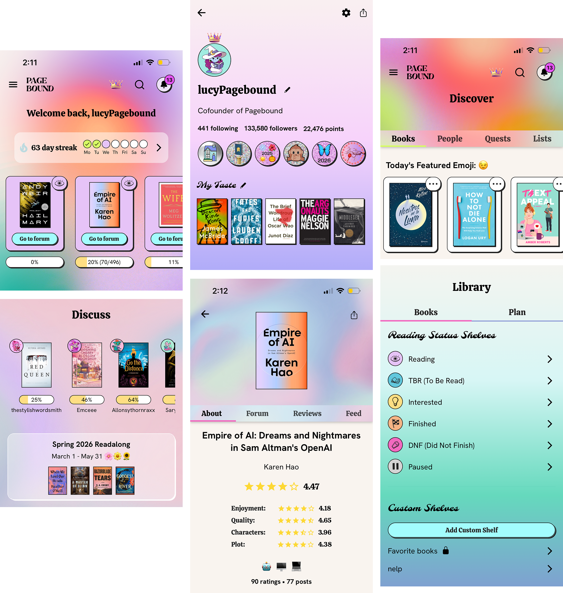
As I started prototyping app designs in early 2025, it quickly became clear that we’d need a new logo. As a new form factor, the app presented both opportunities and challenges. While “old-internet” was nostalgic on web, we were wary of it translating as “clunky” in an app interface with sleeker interactions: tabs that swipe smoothly, bottom sheets that sweep upwards. We were excited to adapt our aesthetic to the app and give it its own identity. We’d keep the website as is and have designs that were sisters, not twins.
For the app, we leaned groovier: font swaps, more saturated colors, and organic gradients. We kept our core colors and our drop shadow.
With the look of the app established, we set out to create a new logo that would feel at home in both designs. The purple squiggle wasn’t distinct or meaningful enough to stand on its own, especially as an app icon. So, we had 2 tasks: create a wordmark/text logo and a logomark/pictogram.
For the wordmark, we overlayed font options on top of different gradients and asked our Top Contributors to vote on their favorite:
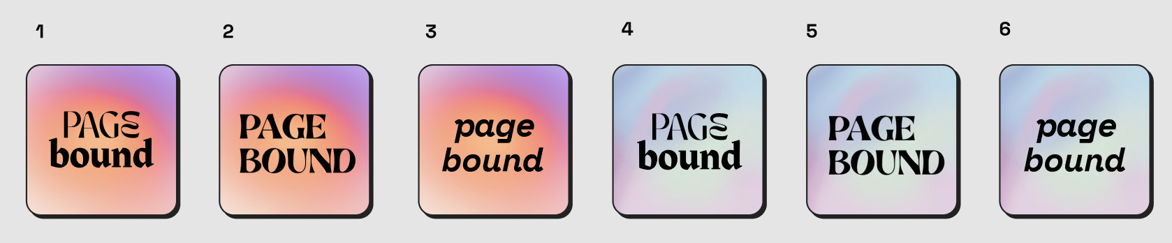
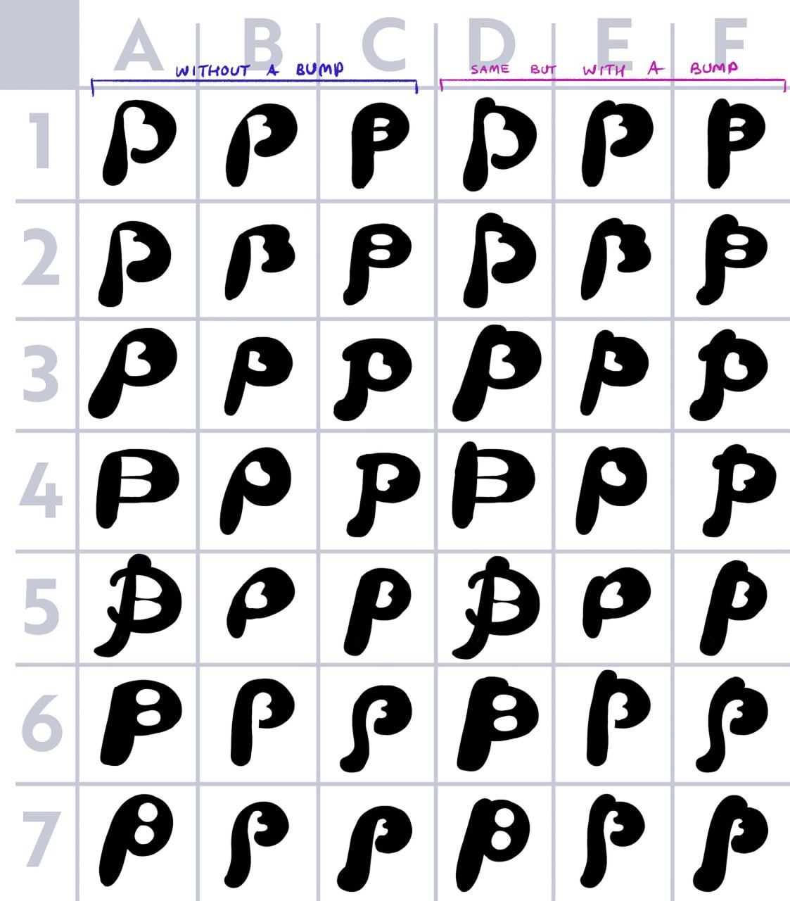
We had a very clear winner. The logomark or app icon was more challenging, and we started working with illustrator Mariam Chagelishvili (also the creator of our avatars!) to bring our vision to life. I started by sketching some quick Ps for Jennifer and I to align on direction:
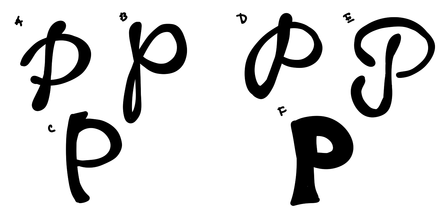
We both liked A, D, and E (though E was too reminiscent of the Pinterest logo). Mariam then created many variants to help us further narrow down direction:
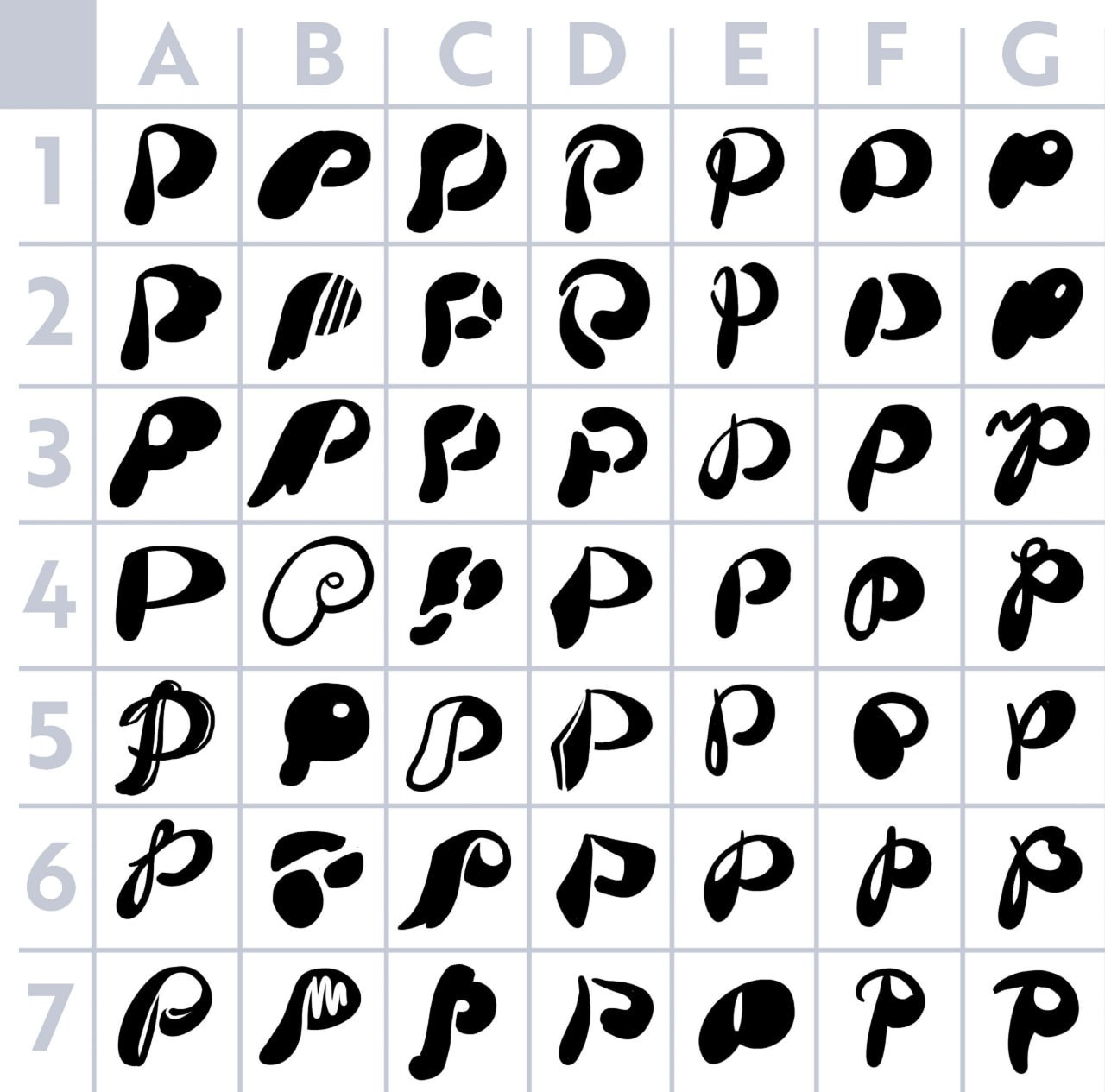
From here, we really liked the thicker, curved Ps (many of the options in column A). A few of these images started incorporating a B into the P (2A, 3A, 6G), which inspired Jennifer to sketch this concept:
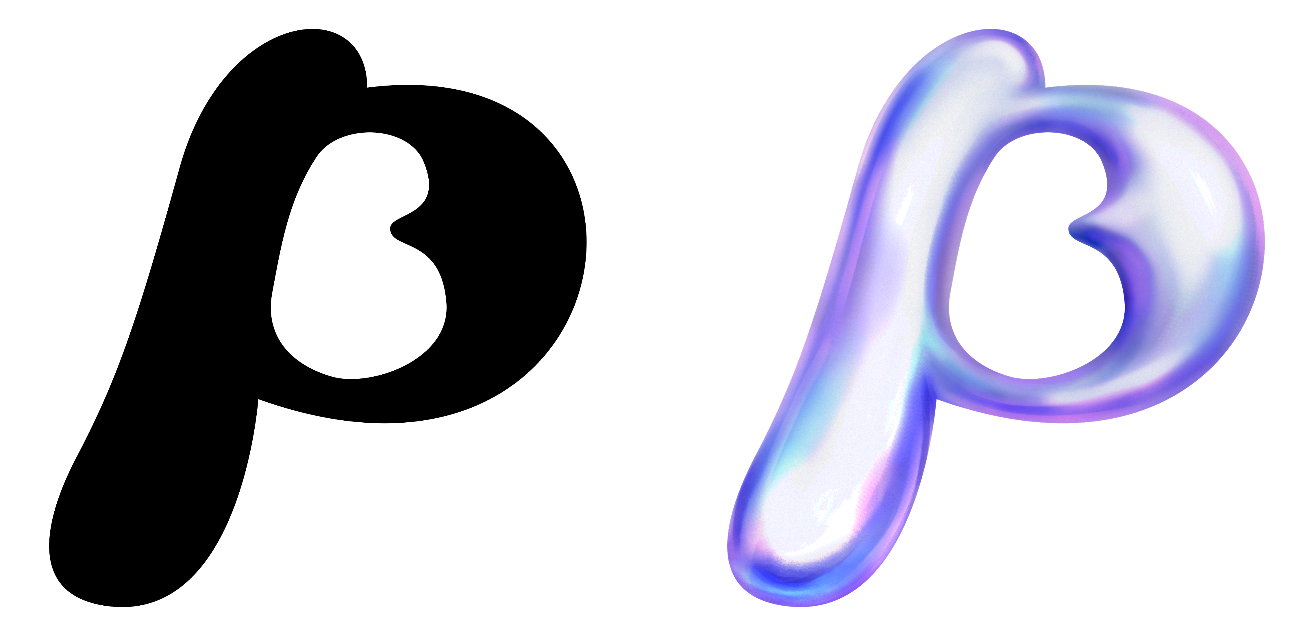
Mariam then did another turn incorporating our feedback and playing around with options for a distinct B inside the P. Can you spot here the early version of our current logo? Which one do you think it is?
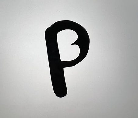
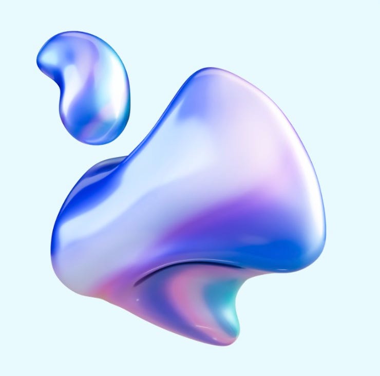
With our base shape decided, the next step was to add interest and color. We had been excited from the start about a dynamic, 3D logomark that would be reminiscent of our drop shadows and the multidimensional crown for Pagebound Royalty members. We sent Mariam this image as a reference for colors and shading, and she did an incredible job creating our iconic P:
I had always envisioned a logo flexible enough to adapt to and represent our diverse reader community, and this shape was chosen deliberately so we could create images evocative of book genres while still being recognizable as Pagebound’s P. For the launch of the new logo, I created 4 versions of our P for the romance, scifi, horror, and fantasy genres:
I’m eager to incorporate our transforming P in interesting ways in the future, on social media and in our merch store.
love this lil gem of pb design history! the small to big details that have made both the website and app the most whimsy, colorful, and cozy place to be!
I love how much effort was put into the logo. It’s absolutely beautiful. In the era of AI replacing tasks and jobs, this is very refreshing. Rock on 💚